|
1. Tell us about the theme of your game.
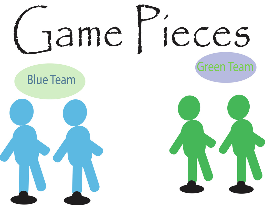
The theme of my game (USA : MISSION IMPOSSIBLE) is that you have to roll dice to move around the board and to pick cards to move around the board to finish. Each card you pick is a card that has a written out 'mission' that you have to complete or you have to go back to start or lose points. I tried to base the game board colors off of the color of grass (green) and the the color of water (blue). I also tried to base it off of the colors of the USA (red, white, and blue). 2. What challenges did you face and how were you to overcome them? During this project I have faces a lot of challenges, but one of them was trying to fit everything on my canvas. For example, when I tried to put in a text to show which way to go when you reach the bottom right corner of my board (to see which way you go), I had a hard time fitting in the " 10 or higher go left and 10 or lower go right." I also had a hard time trying to blend in a clip art I picked to blend in with my background. 3. What part of your game are you most pleased with? In my project I would have to say that my favorite part is how my game fits together. I am pleased with that because I felt really confident on it and I am very proud of it too. What I meant by 'fits together' I meant that it all comes together like a puzzle. 4. What might you change about your game? If I were to change something about my game I would change the game pieces because I didn't spend that much time on them and I feel like I could've made the pieces more creative and more realistic and colorful. Instead of making the people tourists (which I tried to base them off of) I would've made them different. Like a wave of water or a little piece of grass or something related to my game.
0 Comments
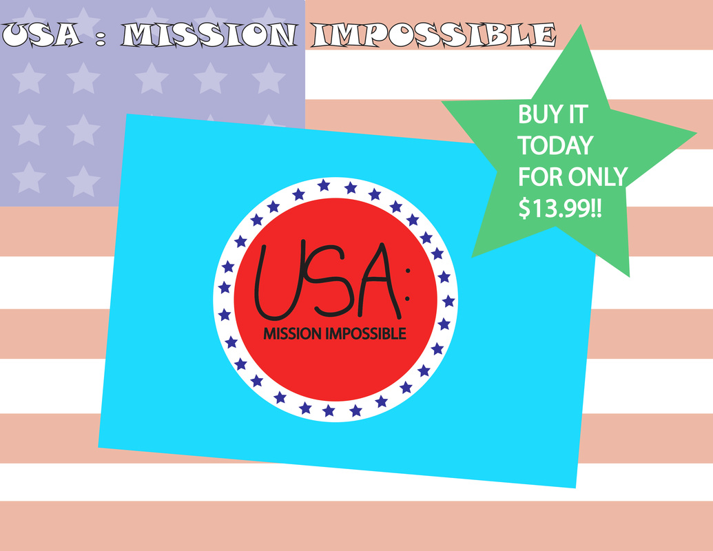 This is my USA: MISSION IMPOSSIBLE advertisement for my game board project.
 This is my game board design so far. I am almost completely done, but I have to add in a background and some additional pieces to fill in blank spaces on my board. I also have to add in some other things for the game board to make sense. For example, how you get the cards in the beginning and throughout the game.
 They all have factors to them that I like, but if I had to pick I would pick either the rectangle or the line segment tool. The rectangle one because the rectangle is already made for you. The line segment tool because you can press shift and it would be a perfect line. When I use the line segment tool I feel like I am more in control. With the rectangle tool when you press shift it makes a big square. I prefer the line segment tool.
 This is my spec sheet for my "Smells Like Wet Dog!" My product is made to keep dogs healthy and clean after a long day outside in the mud and grass. It includes shampoo, conditioner, and sunscreen. Dogs can get a sunburn too! It also prevents bugs and fleas.
While I was brainstorming, it was hard to think of ideas that I wanted to do. So, I thought of things that I liked to do and about my family, and more. I thought of three ideas, but I felt very confident on. The two I picked were a sort of long board that has a pole that is inside of the long board to hold yourself up or for a GO PRO with big wheels to go off road or down steep hills. My other idea was a dog spray that has shampoo, conditioner, and sunscreen in it. For example, when your dog comes inside from outside after a rainy day and he/she smells really bad you just apply to the dogs fur and then wipe off with a paper towel and you're done! That is the idea that I think will have my attention more.

I created my name design like the way I did because I love being on the water (like on my personal page). When I was thinking about the water all these ideas started coming into my head, like the letters of my name on the surfboards and the value of the background. In my design I included line, shape, color, and value. I used line because line is something that starts everything. If it's sketching something for a job or creating a design in art class. I used shape to create the letters of my name, my clouds, the sun, and almost everything on the design. I used color to make the design come alive. What I mean by that is I put in color to explain what each little part meant. For example, imagine what the surfboards with no color would look like. It would look very unreal and weird. Another example are the clouds. They would look like a bunch of circles pressed together all over the place. I used value (for my background) to make it look more real, like, is the sky really just plain blue with no other colors? What about at night? Does the sky stay blue all throughout the day? No it doesn't at night it changes to a darker blue and sometime like an orangish, pink. So that's why I made it a ombre of blue. That's why I made my design.
|
AuthorI am a 6th grader at ROMS in Design Technology. ArchivesCategories |


 RSS Feed
